
UX Case Study
Recipe sharing website
Chen Hayek Davidi


This website is a platform where user can share recipes and find recipes easily by using customized filters. The site is mainly intended for babies and children recipes.
Problems Statement
♦ Providing quick and easy access to recipes for busy parents, especially for children with dietary restrictions.
♦ Another challenge is to get people to be active and not just passive who read the recipe and ignore the whole website.
♦ Users might afraid to share their own recipe because the process might sound frightening.
Description
Solutions
★ Adding filters with categories so the process of finding will take no more than ten seconds.
★ Adding gamification elements can motivate users not to be passive. thess elements enhance the involvement of the user and can turn user from a passive user to an active user.
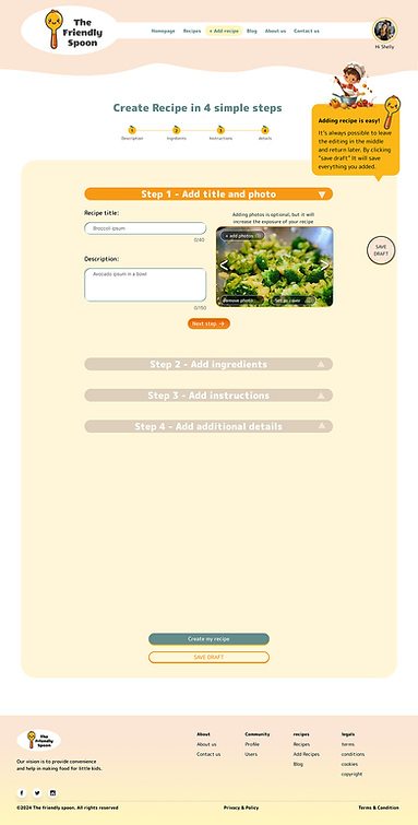
★ The process of adding a recipe will be easy and divided into simple steps.


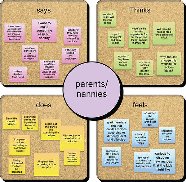
Empathy map
User Persona


Brain Storming
perceptual map
Competitors Research
I found out that most of the recipe sites have additional content about food beyond the recipes and in addition have the possibility to rate recipes.
Through this research, I was able to identify my app's advantage over my competitors


Qualitiative Research
I conducted a qualitative study to check what motivates a person to search recipe online and in what platform.
The user motivations help me understand what to emphasize when building the UX of the website.


Quantitiative Research
I conducted this research to understand user preferences, identifying market trends, validating assumptions, optimizing user experience, and informing decision-making.
Survey Insights
It’s important to make the process of adding recipe simple, If users can't add recipes easily, simply, and intuitively, they'll remain passive, and that's not what we want.
We need to make the experience of discovering recipes easy and convenient for people who are still looking for new recipes.
This research helped me to organize the sections of the homepage in terms of hierarchy of the layout.
Card Sorting
The main difference between the groups is that one group thought that the option to add a recipe was more important and should be first, while the other group thought that searching for a recipe should be at the top of the page. My solution to this dispute is to put both options in an accessible and fast way when you enter the site.
I conducted this research on two groups of five people. Card sorting is an important process in UX as it expresses people's expectations of how navigation and hierarchy should be.


Site Map


Information Architecture

User Journey Map
In the case of my site there are two main processes that take place on the site, finding and reading a recipe and uploading a recipe. Since uploading a recipe is a more complicated process, a table was made that describes the process. In the process, we came across many barriers that would make users not cooperate, and through the brainstorming of what can be done, I came up with solutions that will help users in the entire process of uploading a recipe to the website.
The creation of this table is an important and central part of the UX process, because it allows deciphering the barriers that arise in front of the users and cause them to be passive and in addition not to use the site at all. In answering the questions of what can be done to solve the barrier, we produce solutions that will improve the user experience and make users active.

A/B testing
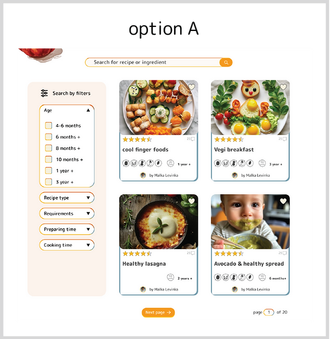
Option A was chosen
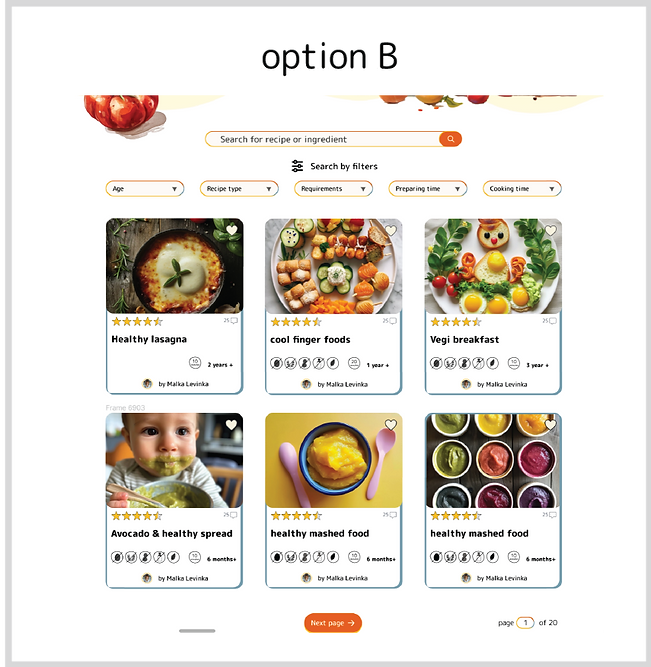
I conducted this test to know how it is better to display the search of the recipes: when the division into categories is on the left, or when the search by categories is above the recipes
Questions asked
1. How is it more convenient to search for the recipe - when the categories are like in option A in the menu on the left side, or like in option B where the menu is one line above?
2. Which is more convenient to view, 3 recipes in one line with smaller text or 2 recipes with larger text?
3. Which option looks better visually?
Wireframes


★ Challenges ★
In order to make the passive users active whenever they participate in the challenge.
★ Leaderboards ★
In order to give the user a good feeling that he is being appreciated and this will increase his motivation to use the site and be active.
★ Badges + Points ★
Creating tiers of "titles" that will make users want to level up through scoring.
★ Progress bar ★
In order to make the process of uploading recipes simpler and more fun.
Gamification Elements
Integrating gamification elements into the app can enhance user motivation and loyalty.
In our case, The elements of gamification can improve the user experience in that they can transform users from passive users who only consume recipes to active participants.
Design Guidelines

Screens


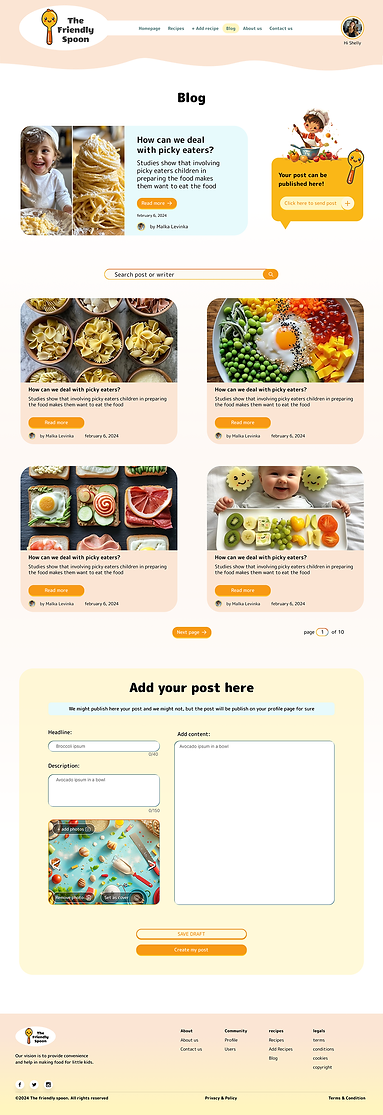


Prototyping
Thank you for reading!


